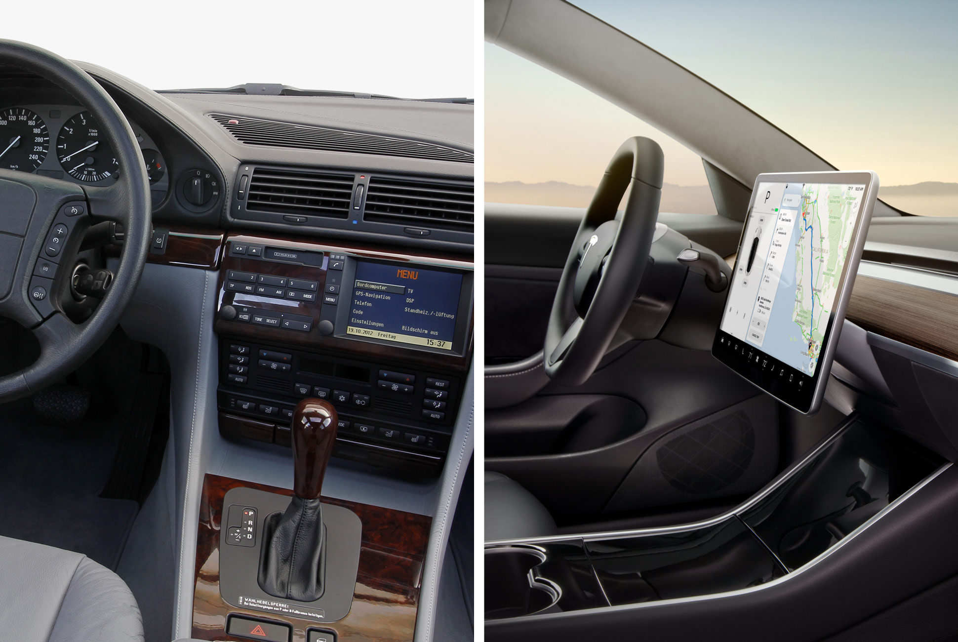
If you’re shopping for a premium car, you want the best technology systems and interfaces available, yet manufacturer features infotainment systems geared toward different drivers. This guide explores the seven best premium infotainment systems currently on the market, including history of the technology, future advances and more.
Prefer to skip directly to the picks? Click here.
Introduction
Infotainment — a clunky but now industry-standard portmanteau of “information” and “entertainment” is the umbrella term describing the main technological interface of a car. This is where all core electronic functions, like stereo, navigation, HVAC, etc., are controlled. Though simpler infotainment systems are available in many vehicles at all price points, they are fixtures in premium cars that serve as the vehicle’s welcome mat. They offer bright, dynamic visual centers that perk up when you climb aboard, delivering elegant swooshes of sound and graphics and glittering logos before depositing you on the system’s home screen.
Thanks to advances in user interfaces, computational power and display tech, infotainment systems have become exceptional across the board, but this is our guide to the best of the best — the rock stars of the premium infotainment world.
Eric Adams is a writer, editor and photographer based in eastern Pennsylvania. His subjects include automotive, travel, technology, gear, health and fitness, aviation, general science and astronomy. In addition to Gear Patrol, he has edited and/or written for Men’s Health, Popular Science, Wired and many other publications. He is on Instagram as @ericadams321.
History of the Infotainment System
In-car audio, navigation and vehicle-control centers have come a long way in just the last decade. At around the turn of the 21st century, onboard information systems in cars were bland, uninspired LCD interfaces that were limited as much by the quality of the display hardware as they were by the division of all the systems it aimed to control. So in most cases, you had only rudimentary graphics, little color and not much to control outside of primitive, CD-based navigation and audio systems. But throughout the Aughts, vehicle systems grew more integrated, and the interfaces used to access them more advanced.
Mind you, dashboard interfaces have always lagged behind other consumer electronics by several years. Smartphones — the gold standard for display systems and fully integrated technology — have far shorter development cycles and product lifespans, with new models coming out annually. Those devices are generally limited to one to two years of moderate use. Systems designed for automotive use, on the other hand, take several years just to design and develop for a single car — especially when multiple vehicle systems are involved — and they have to perform to higher standards of durability and longevity. Cars need to withstand prolonged exposure to heat and cold, for instance, and they have to last 10 years or more.

They also have to be exceptionally reliable and free of any and all glitches, which in a car can spell disaster. (“Can’t access your air conditioner? Too bad!” is not an option.) For all of these reasons, infotainment systems are now very nearly military-grade technologies. But as those systems have achieved such performance, they’ve also brought numerous new capabilities along with them. In today’s systems, car owners can with a few taps on the screen make calls, search destinations, access vehicle cameras for easier parking or off-roading, control seat massagers, analyze track-racing performance, adjust suspension settings, dial-in audio performance and many other things. The infotainment center is increasingly becoming the car’s do-everything hub. Look no further than Tesla for proof — all of its models have central displays that handle every vehicle function, in some cases with the only physical buttons present on the dash being those required by law, such as hazard lights.
Exciting Advances and the Future of Infotainment
We’re in the midst of a steady convergence of the automotive and computer industries. Though this is mostly manifested in electric cars and semi- and fully-autonomous vehicles now in development, it’s also present in the infotainment systems, which draw much inspiration — and brainpower — from those who’ve honed interfaces in the digital realm. That relationship will only grow more intense as the years go by, and as a result, in-car experiences will make immense technological leaps forward.
In the near future, there are two standout systems on the horizon. Audi’s newly redesigned A8, the flagship sedan coming to the U.S. later this year, will bring with it a new MMI (Audi-speak for “multimedia interface”) that features dual touchscreens with a subtle haptic feedback mechanism designed to ease interactions, natural-language voice control and a routing system for the navigation that analyzes previous drives to determine the best — or simply preferred — route to a destination. Meanwhile, Acura’s new RDX crossover will have a unique and intuitive new touchpad interface that replicates the geometry of the screen above it, so instead of using the pad to aim a cursor on the display, your finger placement will simply correspond directly with the “buttons” on the screen. If the target is on the bottom left of the screen, just aim your finger to the same area of the pad and press. It’s instant and doesn’t require hunting around for a cursor or lit-up tile.
Looking beyond these systems, we’re already seeing concept cars that have digital displays stretching the entire width of the vehicle — the better for providing information and entertainment in the age of self-driving cars — and there are even concepts that remove the actual windows completely, allowing movies and games to be displayed in their place, for an all-encompassing experience while the car chauffeurs you through traffic on the way to work.
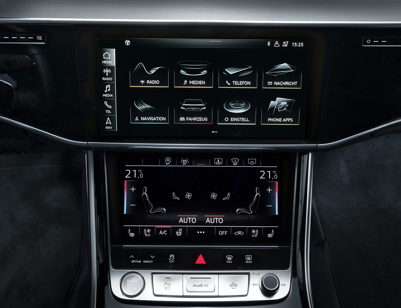
But before all that comes along — autonomy is still decades from widespread adoption, after all — augmented reality will arrive in vehicles to give infotainment systems a major boost. BMW, for instance, is developing augmented-reality glasses that provide drivers — and motorcycle riders, in particular — with data streams right in their field of view. So instead of having to glance down to various displays on your dashboard or in your instrument cluster, the information will be right in front of you, perhaps even integrated into the landscape around you. Navigation instructions will appear on the road ahead of you; audio tracks in the sky above. Though it will start with glasses or goggles, augmented-reality displays will eventually migrate to the vehicle windows, in all directions.
How will you interact with these interfaces? Lots of ways — through voice commands and gesture controls, for starters. BMW’s 7-Series and 5-Series sedans already allow you to control your audio system and call-answering with specific hand and finger movements that it detects with cameras mounted above the dashboard. What’s to come after all this? Mind control, maybe?
Ultimately, it’s quite possible that even the infotainment head unit will go the way of the 8-track, replaced completely by virtual displays.
The Current State of Infotainment
Until then, though, there is much to learn about the latest and greatest infotainment technologies that you can opt for right now. In the descriptions below, note that there are variations within each manufacturer’s lineups. The top-end models — the Audi A8 sedan, the Mercedes S-Class — tend to have the most features, of course, but because all the cars are on different production cycles within each company, they may leapfrog each other in capabilities in order to stay the most current. So at any given time, an entry-level model, for instance, may feel better equipped and more modern than even the top-end flagships, simply because its release date is more recent. Also, packages vary even within individual models, with some capabilities coming standard (backup cameras, say) while other enhancements (head-up displays) are optional. Lastly, and perhaps most importantly, because each infotainment packages can vary even within a manufacturer’s lineup, pricing varies widely from system to system depending on what features you select and what car you purchase. Still, the below guide speaks to each system’s strengths.
The Best Premium Infotainment Systems of 2018
Best Organized: Acura ODMD 2.0
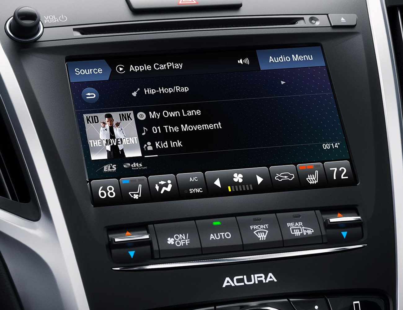
Acura is all about speeding up its interfaces these days — not just in terms of their responsiveness, but also in usability. It’s worked to prioritize information based on what features people use most, and making it easy to get where you want to go. The company’s recently updated On Demand Multi-Use Display 2.0 — appearing first in the TLX sedan and the MDX three-row SUV — includes faster processing and improved access to functions via improved menu structures.
What’s Good: Dual screens. In models that offer it — it’s standard on the TLX and MDX — the strategy places navigation, backup camera views, phone, and Apple CarPlay or Android Auto into the top screen, comfortably within the driver’s line of sight, and audio, climate controls on the lower touchscreen. This means there’s less clutter in each screen, and faster access once you get the hang of it — particularly thanks to the simplified menu system introduced in the current generation.
What to Watch Out For: Dual screens. (Yes, they’re good and bad.) I’ve driven many Acuras with the dual screen setup, but I still find my hand hovering indecisively for a beat while I work to remember which screen does what. Actual owners will quickly get over this, but newcomers to the car and guests might find it befuddling at first.
Design and Interface: The systems are controlled via touchscreen interfaces, and the dual-screen arrangement allows for continued access to climate controls even when connected to Apple CarPlay or Android Auto, which in other vehicles often requires flipping back and forth between the smartphone interface and the native interface to make changes elsewhere. Overall, the look of the system is sleek and modern, yet efficient and clear when it needs to be.
Special Features: The new version features clearer capacitive displays as well as faster response times from the upgraded software — up to 30 percent quicker. This means you don’t have to endure those extra milliseconds of hang time after you press the button, which can, in reality, be quite frustrating. The systems also support Apple CarPlay and Android Auto, through the top screen.
Verdict: Acura’s system used to look like a bad Powerpoint presentation, but in recent years it has modernized to the point of being vastly more functional and appealing. ODMD 2.0 has been a breath of fresh air, and the upgrades coming out in the new RDX promise to jack up its usability even higher.
Best Controls: Audi MMI and Virtual Cockpit
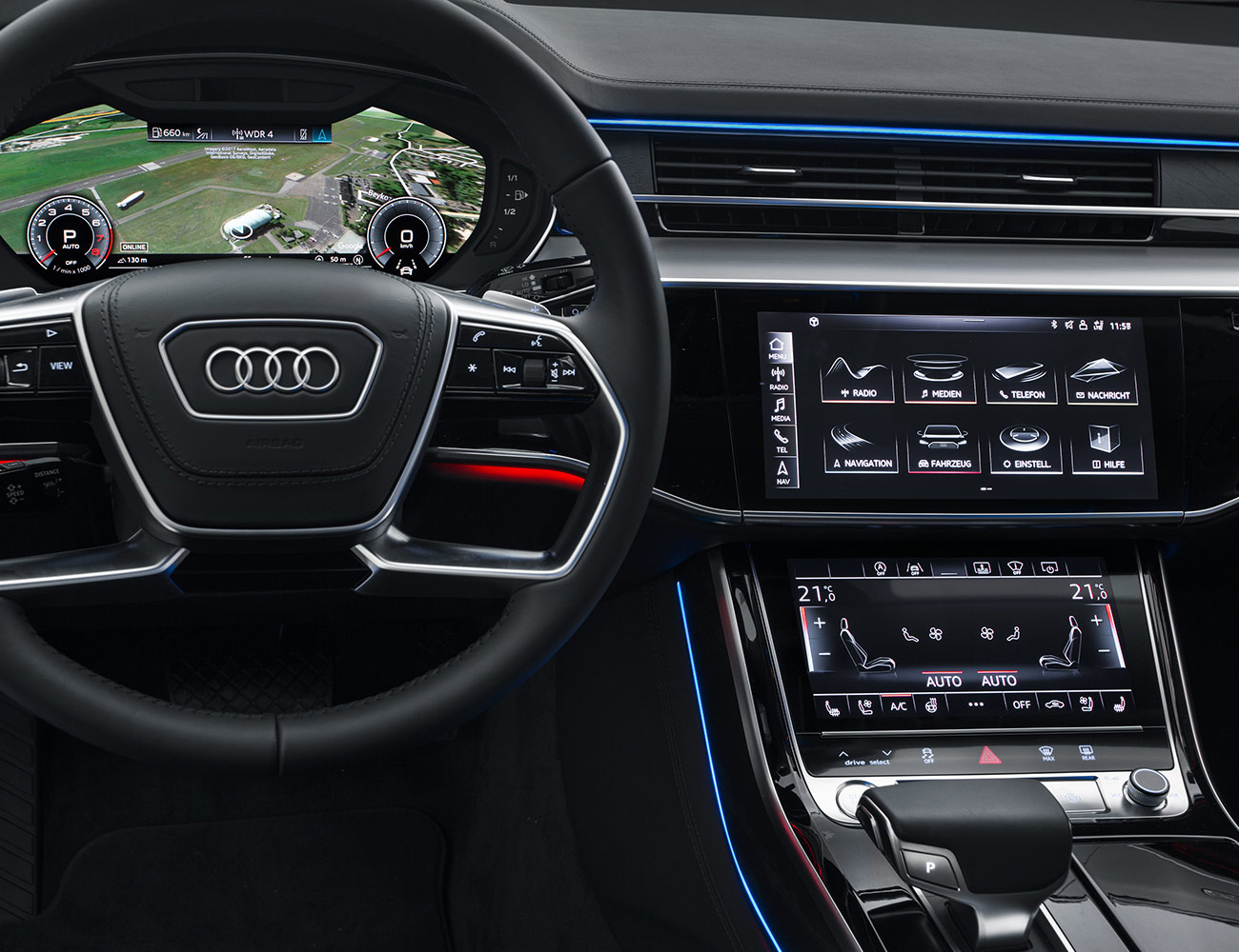
Audi’s MMI interface is one of the best in the business, featuring smartly designed touchpads and input dials, super-smooth Google-based mapping and a virtual cockpit that allows for better-than-average customization of the layout and appearance in the display directly in front of the driver.
What’s Good: Google-based 3D mapping provides excellent, familiar context when navigating new environments, particularly in cities. Its touchpads are also very smartly designed with, in some cases (depending on the specific model’s available real estate and the vehicle’s place in the Audi hierarchy) dedicated buttons for numerals. But all provide handwriting recognition for speedier inputs of destination or favorites info.
What to Watch Out For: Voice commands can be terrific aids, but only if you remember the precise way your system likes to hear its instructions. Audi’s systems include a list of 30 or so commands you can enter vocally, but you’ll only likely use a few with any real frequency. Keeping the list handy in the car for the first few months of ownership will help you internalize more of the commands.
Design and Interface: As with all manufacturers, the systems vary from car to car but typically retain the core functionalities. When combined with Audi’s new Virtual Cockpit display, the dashboard becomes IMAX-worthy in terms of beauty and is functionally in-depth.
Special Features: If you opt for the connectivity feature, the car will provide hotspot functionality as well as local traffic and weather, news and other features. The hotspot is particularly useful while traveling, as sometimes it pulls in a better signal than your own smartphone can thanks to its more robust antenna system.
Verdict: Audi’s current MMI is a notably excellent system, particularly the gorgeous Virtual Cockpit display when in map mode. There, the Google Earth imagery helps orient you to your surroundings and lets you keep better tabs on your route. This system, though, is now several years old, and the version rolling out with the new A8 later this year will hopefully revitalize it.
Most Innovative: BMW iDrive
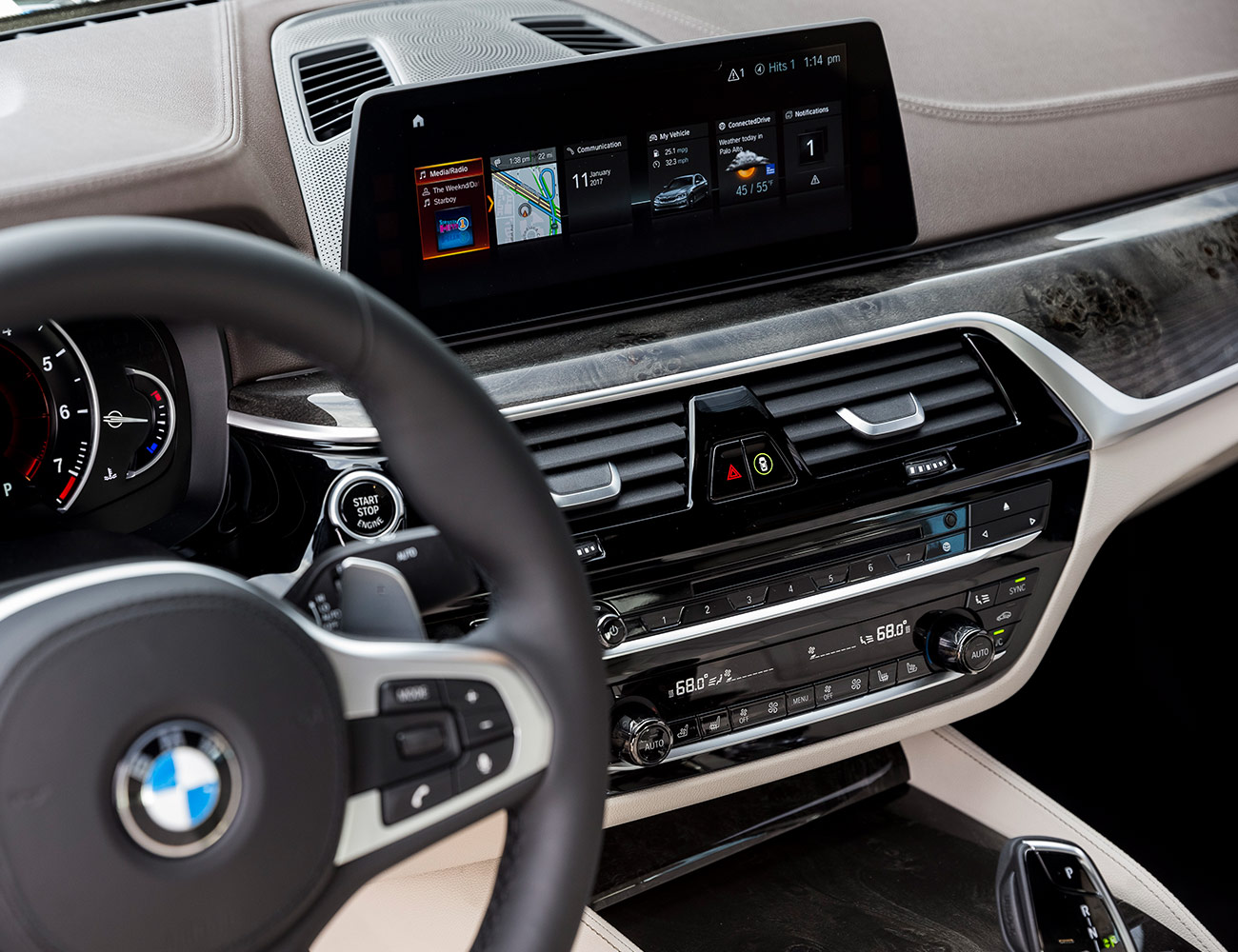
BMW’s iDrive system has evolved into the smooth, sophisticated interface everyone expects from BMW. Its combo joystick/dial allows crisp navigation of the menus, while voice controls, its new gesture controls — first appearing in the 5-Series and 7-Series — and a modest smattering of physical buttons help plug the gaps in its use. Most importantly, its overall organization and design feels like it’s from a company that has learned a thing or two along the way.
What’s Good: The big knob: a straightforward single-point interface with the system, which can be easily augmented via alternative buttons and gestures. It remains the signature feature of the system, and over the years BMW has honed its look, feel, and action pretty much to perfection. The buttons surrounding the knob offer familiar shortcuts — home, back, etc. — and everything works briskly and efficiently to get you where you want to be with little fuss.
What to Watch Out For: Interface overload. When you have the option of talking, touching, pressing and gesticulating to control it, a system designed to simplify interactions can actually end up cluttering your console. That’s not such a big deal with owners, but for those new to the car, it can quickly become overwhelming.
Design and Interface: The newest versions feature larger head-up displays in front of the driver, and the company has also recently added — first in the X3 crossover — touchscreens with moveable tiles to enhance customization. The graphics are also crisp and modern, with nicely legible text and icons, helping minimize distraction during use. The system’s voice control also incorporates natural language comprehension, so you can just speak to it casually without having to constantly bone up on a bunch of pre-scripted commands and instructions.
Special Features: Obviously, the gesture control system is the big trick here. With this, users can execute a variety of discrete motions with their hands to adjust the audio volume (a slowly spinning finger), answer or reject calls (a swiping motion), or execute customizable commands — a two-finger jab can be programmed to take you home, mute the volume, etc. At first, it feels kind of silly, then it feels like the future.
Verdict: iDrive has consistently been among the highest quality infotainment systems out there. It got off to a rocky start years ago and became something of a whipping-boy for haters thanks to its initial awkwardness, but it got over that period quickly and remains a solid, intuitive system. The fact is, sometimes with dynamic, high-end infotainment controls, users struggle with basic controllability. iDrive simply isn’t that. You get in, and you get it.
Best Design: Jaguar/Land Rover Touch Pro Duo
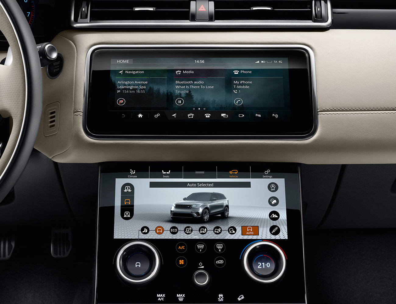
Jaguar/Land Rover’s newest infotainment system appears in the Range Rover, Range Rover Velar, and Range Rover Sport, as well as the new I-Pace electric SUV. But the system really owes its success to its visual kinship with the Velar, the high-design SUV ride that’s both streamlined and minimalist yet still a fully capable Range Rover. Similarly, the Touch Pro Duo system, which debuted with the Velar, is both gorgeous — even when turned off — and simply an excellent interface for its vehicles.
What’s Good: Land Rovers and Jags are together cut from a different cloth, with a uniquely British flair. The infotainment system reflects that with its clarity, ease of use, and visual appeal. In the Velar, two high-def 10-inch touchscreens anchor the system, with the upper screen divided into three panels — media, navigation, and phone — and the lower screen focused on vehicle systems, including climate control and the off-road-oriented Terrain Response system. This lower panel operates without the dynamic flash of the upper screen, meaning it’s a steady presence and always ready for direct, immediate action.
What to Watch Out For: Systems that rely on vast expanses of glass tend to draw a lot of smudges and fingerprints when in use — and they can also generate a good bit of glare. Resistance to these hazards is embedded in the glass coatings — and it indeed seemed glare-free even in direct light — but the smudging remains a minor issue. Keep a microfiber cloth handy and give it a little polish every now and then. Also, capacitive-touch controls, such as those found in this system, can be prone to accidental activation. But this didn’t emerge as a real problem during testing.
Design and Interface: Of all the touch-oriented systems, this one has perhaps the most familiar and smartphone/tablet-like interface. It looks and behaves like its handheld counterparts, allowing easy swiping left or right to change screens and pinch-to-zoom while scanning maps. It also possesses an exceptionally sleek construction that blends in perfectly to the console that surrounds it. Even the dials are high-tech, with the two primary ones featuring embedded LCD displays that can change function from temperature to massage seat settings to the off-road mode selection.
Special Features: An Intel quad-core processor keeps things brisk and responsive, and persistent connectivity allows for a stream of news and weather reports, as well as the ability to send your location and ETA to a chosen contact via email or text message. On arrival, the maps will convert to a 360-degree interactive view of your environment that includes street-level imagery to help you orient yourself, find parking, etc. Finally, there’s a Planner app that lets you program your route in advance from a smartphone and upload it straight to the car.
Verdict: Thumbs-up. The system sets a high bar that in many ways exceeds that of all its competitors. A key part of the reason for this is that the system is engaging, intuitive and, frankly, fun. It makes you feel like it was designed just for you, and that’s a tough thing to do.
Best Content: Lexus Enform
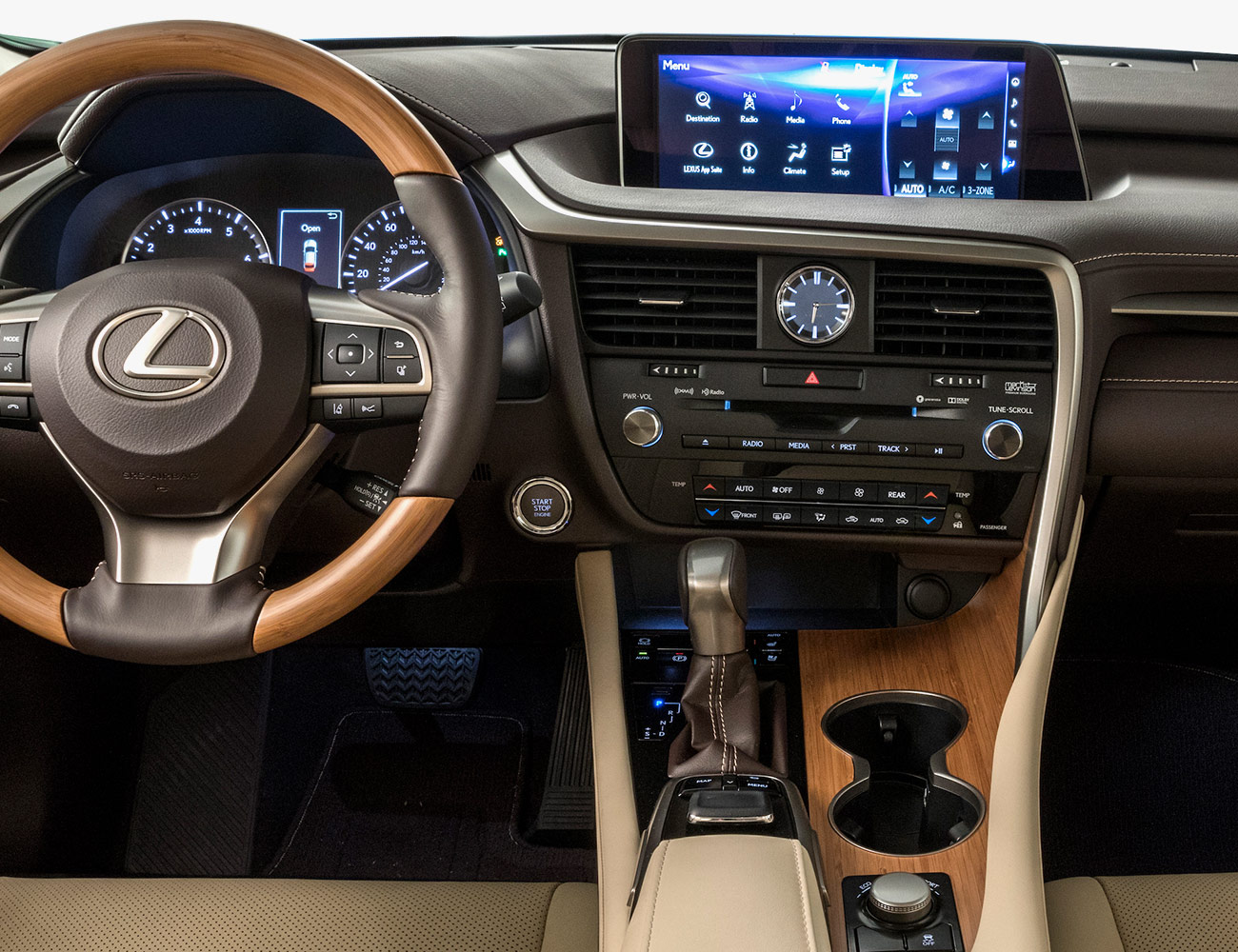
In addition to including the expected baseline of capabilities — Bluetooth, navigation, etc. — the Lexus Enform infotainment system brings a lot of cool surprises to the table, including 10 years of complimentary emergency assistance and a wide roster of third-party apps that help you immediately customize your entertainment and information options. Plus, its onboard connectivity option keeps everything updated and current automatically.
What’s Good: The app system provides access — via the optional connectivity package — to a variety of familiar services, including Yelp, Slacker, Pandora, NPR, and sports, news, and financial information. You can also order movie tickets, book restaurant reservations, find gas and lodging quickly and easily, and generally search for services or destinations you need.
What to Watch Out For: Be wary of overreliance to even these top-shelf onboard information systems. Even though they are updated persistently, in my own sampling of such systems they haven’t always been the last word on what’s available — whether it’s restaurant options or gas locations. Sometimes it’s better to double-check via a broader smartphone search than to rely on an app with a database of uncertain provenance.
Design and Interface: Particularly in the flagship LS, Lexus’s infotainment design and assorted interfaces are all very high quality. The LS boasts a large 12.3-inch center display, as well as a staggeringly good 24-inch head-up display. You can even program in a customized image to greet you when you enter the car. The steering-wheel controls and the dynamic touchpad are also fluid and intuitive in practice.
Special Features: The big trick up Enform’s sleeve is Dynamic Navigation, which uses the onboard connectivity to monitor traffic while deciding on routing options, provide points-of-interest that are of actual interest to you and stay updated with new map content.
Verdict: Lexus undeniably produces a quality product from bumper to bumper, and this is just as true with the infotainment system. It’s not particularly exciting or energetic in its presentation, but overall the look and feel is very smart and upscale.
Best Integration: Mercedes-Benz COMAND
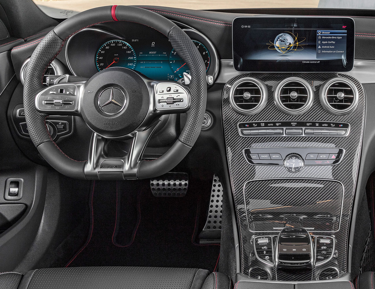
The Mercedes COMAND infotainment system is a classic example of the challenges associated with keeping such systems current. Introduced in the early 2000’s it has been updated along the way but never completely replaced — a huge process that required deep-tissue integration into new vehicles. Fortunately, the company revealed its new MBUX system at the Consumer Electronics Show in Las Vegas in January, though it won’t begin its rollout until the new A-Class arrives this fall. While the COMAND system is really showing its age, with outdated graphics, a cumbersome scrolling-tile system in most applications and no touchscreens, it does still have a lot going for it.
What’s Good: The current system does indeed do a great job of integrating all the vehicles’ systems, and that’s no small achievement. Access to all vehicle systems is quick and easy, and crossover compatibility — for instance, muting the audio when a call comes in — is exceptionally well executed. It also helps that the Mercedes Mbrace suite of connectivity functions gives a modern set of capabilities to the system, including remote access and assorted Internet-based audio services.
What to Watch Out For: The lack of a touchscreen is the current systems biggest drawback, especially considering that Apple CarPlay and Android Auto were designed around such interfaces. But the primary controller is quick and easy enough to help compensate.
Design and Interface: The newest display technologies — the wide display in the recently refreshed S-Class, for instance — make the system menus and assorted screens look pretty great, thanks to their high contrast and glossy feel. The controller and touchpad, which permits handwriting recognition, are comfortably placed and work really well with the system, allowing quick navigation and data entry. Voice controls help, as do the new micro-touchpads found on some models’ steering wheels. These Touch Control Buttons allow you to quickly swipe in various directions with your thumbs — or press to make selections — to control the multimedia system.
Special Features: In the case of the S-Class, the widescreen cockpit display includes both the instrument cluster and the COMAND screen, providing a seamless digital cockpit effect. It’s customizable, so you can fine-tune the appearance to suit your tastes.
Verdict: Its time has come, and fortunately Mercedes is finally replacing the system. The new one, MBUX, looks like it could be one of the best available when it starts appearing in new vehicles. Until then, new Mercedes buyers may not exactly be excited by the current system, but it’s still perfectly functional and useful. It gets the job done, if little else.
Least Pretentious: Porsche PCM
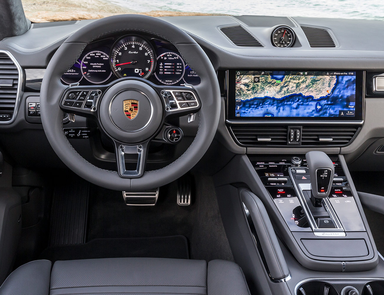
Porsche drivers don’t spend a lot of time fussing over dancing graphics and things like handwriting recognition. Porsche drivers care about going fast. Everything else is a distraction. So it makes perfect sense that of the premium infotainment systems out there, Porsche’s would be the most straightforward and packing the least window dressing. The latest Porsche Communication Management systems look great, mind you — but they cut straight to the chase whenever possible. I like that.
What’s Good: The system’s bright, high-definition screen — up to 12 inches in some models, including Panamera — features a proximity sensor that can detect your hand’s presence near the screen and whisk away visual clutter, allowing for full-screen presentation of a function without a lot of extraneous buttons present. The home screen design and customizable widgets provide high flexibility and immediate access.
What to Watch Out For: Just keep your eyes on the road. Fortunately, Porsche’s infotainment interfaces are designed to present minimal distraction as well as minimal interference when you are trying to use them.
Design and Interface: Everything in Porsche’s PCM is clear and comprehensible at a glance, which is important in enthusiast driving. The systems vary from car to car but share basic functionality and input systems, including touchscreens and voice command functionality. They fit in seamlessly with the vehicles without drawing attention to themselves. Again: no distractions.
Special Features: An internal hard drive sounds pretty old-school, but what better way to store your racetrack playlist without your smartphone banging around the console? There are also app-based features available through Porsche Connect — the car’s optional connectivity system: Porsche Car Connect lets you access vehicle data from your smartphone, control vehicle functions like firing up the air conditioning and send route information straight to the car. Also available: smartphone apps that let you record video and vehicle data while off-roading or on the racetrack.
Verdict: PCM has long balanced between basic, contemporary functionality and service to enthusiast drivers. Its current system meets all expectations and even throws in some bonus features for the driving enthusiasts, via the smartphone apps and various data tracking. It’s precisely what a Porsche infotainment system should be.
The average price for an SUV 2017 was just under $40,000 — to cover all the bases, we bumped the budget up to $50,000 and chose the best new SUVs you can buy in 2018. Read the Story

