Whoa, easy on the squinting there, folks. We know, the new Aston Martin logo looks basically the same as the old one. But we promise, it has changed. Here, take a look at the old one (below, left) next to the new one (below, right).
![]()
![]()
There, now do you see it? Aston dropped the single vertical line at the bottom and the inverted arch. Also, the lines are thicker. It’s like Aston Martin highlighted the badge and clicked “bold.” It also happens to be the eighth redesign of the logo. The original appeared on Astons in 1920, with subsequent designs launching in 1927, 1930, 1932, 1954, 1984, 2003, and now. You can see all of them in order below.
Aston probably wouldn’t be that put off by us describing the new logo as the old one, but “bold,” because the company’s new tag line follows suit: “Intensity. Driven.” Yes, the tag line is basically a synonym for “bold.”
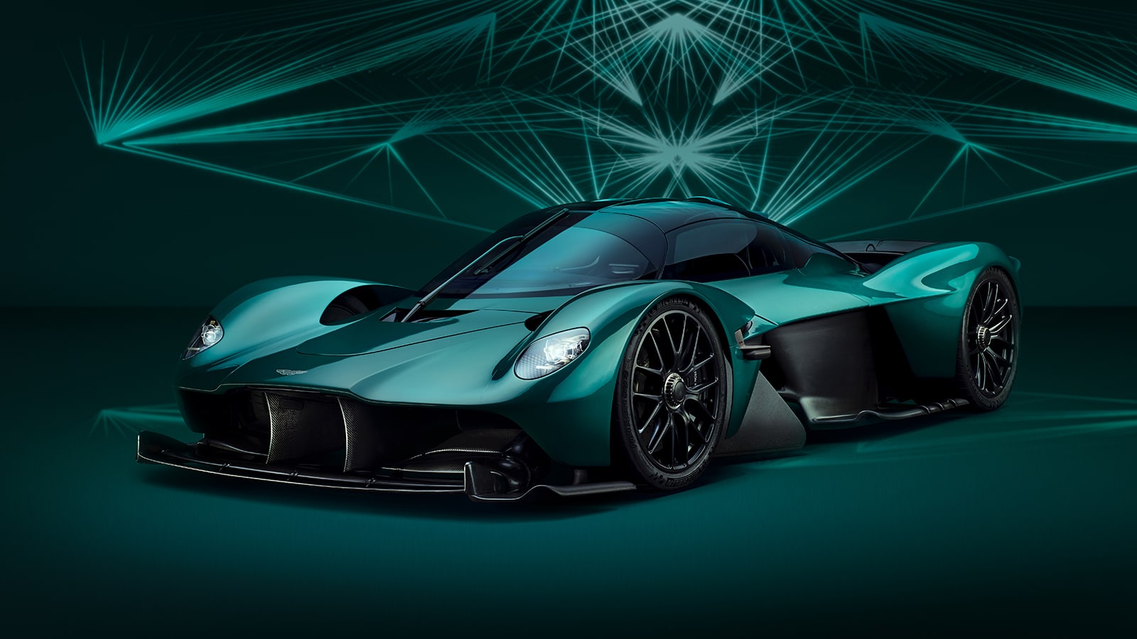
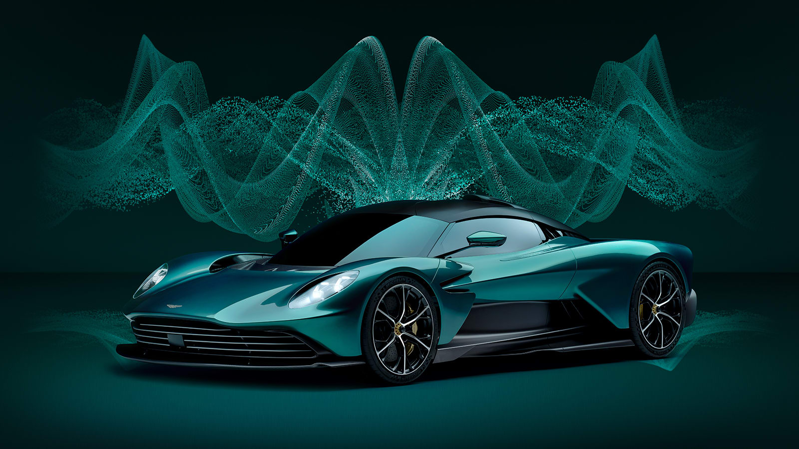
Aston says the new branding is part of a new focus on providing luxury cars with maximum performance. It also seems to reflect the brand’s upcoming roster of mid-engine sports cars with the F1-inspired Valkyrie (above, left), now in production, and the less extreme Valhalla (above, right), the latter of which will start deliveries in 2024.
The new badging will appear on the Aston Martin F1 cars, and will also appear on these new-generation Aston sports cars.
Related video: