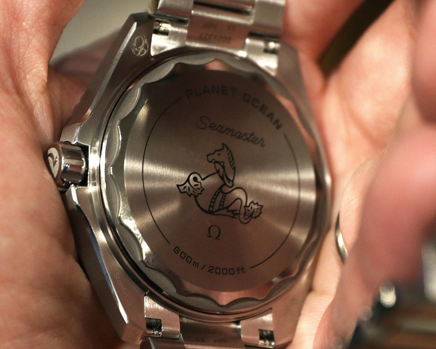
The thinness was achieved in a number of ways. Obviously, the case was completely redesigned and the helium escape valve jettisoned (let’s be real, you weren’t going to use it). The watch is flatter overall, with a new flat sapphire crystal, and the sapphire display caseback has been replaced by a solid one, which is in Grade 5 titanium, even though the rest of the case is in steel. This helps both thin down and lighten the watch.

Although I welcome the return of a solid caseback and love that it’s in Grade 5 titanium, I don’t care for the laser-engraved hippocampus logo. It looks cheap compared to the deeply embossed, relief-style hippocampus logos found on older Planet Oceans. I’m not sure if the titanium makes such a seahorse impossible to produce, but I definitely felt like the watch was missing this detail.
Lastly, the new Planet Ocean borrows some technology from the Ultra Deep in the form of an inner titanium ring that helps seal the watch at great depths. This ring not only saves space when securing the watch to 600m, but it’s also visible on the dial side (polished, of course), mimicking the metal ring around the dial on the original Planet Ocean. Only now, the ring actually serves a purpose, which is pretty cool.
Orange you glad?
The new Planet Ocean comes in three colors to start: Black, Blue and Orange. All feature the same matte-black dial and applied Super-LumiNova-filled indices and double-arrow handset. As before, bicolor lume is used, with green for the minute hand and bezel pip and blue for all other hands and the indices.
The differences are limited to the colors of their polished ceramic bezels and the Arabic numerals at 12, 3, 6 and 9 — that’s right, there’s no date window here. Do you like it yet, Reddit?? The font used for the Arabics is new, with a futuristic open design and more angularity to better match the redesigned case and bracelet. Each reference also features differently colored numerals on its dial: orange for Orange, white for Blue and rhodium-plated for Black.