
Welcome to Further Details, a series dedicated to ubiquitous but overlooked elements hidden on your favorite products. This week: the mysterious symbol on Apple’s Command Key.
If you’re over the age of about 25, there’s a good chance you didn’t learn how to use a computer on a Mac. If so, you probably never met the Command key — that large button with a pretzel-shaped logo next to your space bar — until well into your computer-using life . The Command key is arguably the most important key on a Mac, and required for just about every major keyboard shortcut. But what was the original purpose of this key that is unique to Macs and, more curiously, why does it look so weird?
The Command key dates back to the early 1980s, and its secrets are bound up in its original name: the “Apple key.” According to Andy Hertzfeld, an American software engineer who helped develop the original Macintosh computer, the original purpose of the key is to allow you to completely do away with a mouse. In combination with the other keys, it allows you to operate your machine without ever touching — or even having — a mouse, a situation that was far more common before the trackpad laptop took over computing.

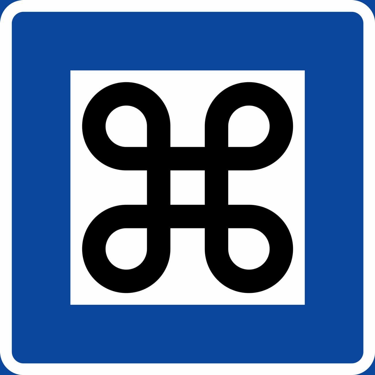
The current pretzel-shaped design is used on Swedish signs to indicate an interesting point on a campground.
The name “Command” key, and the now-iconic symbol, are in part thanks to the whims of Steve Jobs. During the development of MacDraw, a drawing app that released with the Apple Macintosh in 1984, Steve Jobs decided the Apple name and logo were being overused, which was diluting the brand. The Apple logo, for instance, was everywhere — on every menu screen, all over the keyboard and, of course, directly on the Apple key. It was a situation Jobs described as “taking the Apple logo in vain.”
That decision meant there would also need to be an alternative logo, a duty that fell to Susan Kare, Apple’s resident bitmap artist at the time. Tasked with finding a symbol to represent the very abstract notion of “command,” Kare came upon the current now-iconic pretzel-shaped design, a shape used in Nordic countries to indicate a campground on a map. Almost 30 years later, the symbol still persists. And why not? Can you think of anything better?